David
Diamond Member
Joined: January 2009
Posts: 16,804
|
Post by David on Oct 4, 2011 1:26:52 GMT -5
|
|
think pink.
Diamond Member
👑 💅🏻
Joined: April 2011
Posts: 23,800 
|
Post by think pink. on Oct 6, 2011 11:25:47 GMT -5
Oh my  She's a beautiful girl, they should have show cased that on the cover. |
|
Deleted
Joined: January 1970
Posts: 0
|
Post by Deleted on Oct 6, 2011 11:27:22 GMT -5
|
|
think pink.
Diamond Member
👑 💅🏻
Joined: April 2011
Posts: 23,800
|
Post by think pink. on Oct 6, 2011 11:36:23 GMT -5
I think this is a great cover  . |
|
leoapp
4x Platinum Member
Joined: March 2008
Posts: 4,984
|
Post by leoapp on Oct 6, 2011 22:20:38 GMT -5
These cover are my least fave from Mariah  1. The theme is about angel she dresses like a slut? 2. Too much photoshop, her boobs, and her body!!! 3. The 3 shadows of the boobs don't match at all with the boobs, much bigger, weirdly, the shadow is getting bigger and bigger to the right. And WTF, her right and left boobs on right Mariah are asymmetric 4. The left hand on left Mariah and the right hand on right Mariah mysteriously disappear. 5. Hate her face expression on right Mariah!  1. The font is meh, seriously, pinkish purple font on black and white picture? And no Carey, just Mariah? 2. Her pose is also meh, what's the point of lifting her right hand and showing her right armpit and hiding her right arm? 3. The position of E=MC2 is so random |
|
Deleted
Joined: January 1970
Posts: 0
|
Post by Deleted on Oct 6, 2011 22:42:31 GMT -5
Aside from the photoshop on her boobs, I actually like the Memoirs cover. |
|
Deleted
Joined: January 1970
Posts: 0
|
Post by Deleted on Oct 7, 2011 1:11:00 GMT -5
Everyone's criticized this cover, but I honestly don't see what's so wrong with it... ??? I think she looks beautiful and I really like the font on the cover. The only semi-off-putting thing about it, for me, would be the flowers, and even those are still fine. |
|
Gravity.
7x Platinum Member
Mischief Managed
Truth.
Joined: February 2009
Posts: 7,962 
|
Post by Gravity. on Oct 7, 2011 10:31:03 GMT -5
She looks like she's on the verge of tears, for starters. I just don't think that it looks good at all.
|
|
.indulgecountry
Diamond Member
Best Country Poster 2011, 2017, & 2018
"You left a mark on my face // And brought a dozen red flags in a vase"
|
Post by .indulgecountry on Oct 7, 2011 17:40:30 GMT -5
She looks really old in the picture; she doesn't look like she's only 16. I don't know what it is, but its just a poorly-taken picture. I do like the font and the flowers though. But that picture of her makes her look so old to me. |
|
horchata
6x Platinum Member
Joined: May 2011
Posts: 6,241
|
Post by horchata on Oct 7, 2011 18:58:27 GMT -5
The flowers look tacky and it looks weird, should of just been a regular face forward headshot. The position of the font in contrast to the picture of her also makes it look more than awkward. Someone at Coverlandia or Spill It Now could of made a better cover than that. The editing in general is just a mess.
|
|
Lozzy
Diamond Member
Joined: January 2010
Posts: 49,237
|
Post by Lozzy on Oct 8, 2011 3:18:44 GMT -5
The Memoirs of an Imperfect Angel cover is definitely one of the worst ever.
|
|
Carlitoz
2x Platinum Member
Joined: October 2003
Posts: 2,691
|
Post by Carlitoz on Oct 8, 2011 17:17:03 GMT -5
The Memoirs of an Imperfect Angel cover is definitely one of the worst ever. Completely agree. Hate how those arms just disappear and the shadows too. They could've used perhaps just the Mariah in the center...... |
|
Amy
Gold Member
Loan me a dragon, I wanna see space
Joined: February 2008
Posts: 790
|
Post by Amy on Oct 8, 2011 18:57:52 GMT -5
|
|
Deleted
Joined: January 1970
Posts: 0
|
Post by Deleted on Oct 8, 2011 19:21:37 GMT -5
|
|
|
|
Post by livelikedying111 on Oct 8, 2011 20:01:24 GMT -5
Trick Daddy's hilarious!
Pixie Lott desereves it. She's so freaking hot, I mean damn, even a friend of mine who hasn't heard a song of hers, and never will (only if he wants to watch her videos for her that is..), and she puts that as an album cover? why on earh would she fugly herself up??? so that look fits the title, so what? stupid ass...
|
|
Mack
7x Platinum Member
Joined: June 2010
Posts: 7,381
|
Post by Mack on Oct 8, 2011 20:31:58 GMT -5
The Memoirs of an Imperfect Angel cover is definitely one of the worst ever. Yeah, it is pretty bad. Not only does it look entirely cheap, but it doesn't match the vibe of the album at all. |
|
dbhmr
Diamond Member
>
Joined: January 2005
Posts: 23,301
|
Post by dbhmr on Oct 9, 2011 23:28:17 GMT -5
Can't believe this atrocity hasn't been posted yet.  |
|
alchemist
New Member
Joined: November 2009
Posts: 464
|
Post by alchemist on Oct 10, 2011 9:22:33 GMT -5
Its very retro like an old vinyl LP cover from the 50's which is perfect for the album since its all songs from the 50s. |
|
hazeleyes
New Member
Joined: May 2010
Posts: 48
|
Post by hazeleyes on Oct 11, 2011 13:45:37 GMT -5
Everyone's criticized this cover, but I honestly don't see what's so wrong with it... ??? I think she looks beautiful and I really like the font on the cover. The only semi-off-putting thing about it, for me, would be the flowers, and even those are still fine. This. I don't see what the hate is for. |
|
Taylor.
Moderator
Joined: January 2007
Posts: 18,687
Staff
|
Post by Taylor. on Oct 11, 2011 15:44:08 GMT -5
I'm in the minority, but...  |
|
summers
Platinum Member
Joined: April 2008
Posts: 1,587
|
Post by summers on Oct 11, 2011 23:33:41 GMT -5
^ Is that really gonna be the cover? Really?
|
|
|
|
Post by K. on Jun 18, 2012 12:55:46 GMT -5
New one:  |
|
|
|
Post by josh on Jun 18, 2012 17:04:56 GMT -5
|
|
Deleted
Joined: January 1970
Posts: 0
|
Post by Deleted on Jun 18, 2012 17:23:36 GMT -5
^It looks like one of those backgrounds you do in Photobooth on a Mac and insert yourself in. It's just so bad, cheap, embarrassing, fake, etc.
|
|
Mack
7x Platinum Member
Joined: June 2010
Posts: 7,381
|
Post by Mack on Jun 18, 2012 17:29:41 GMT -5
Yeah, that is really dreadful, especially when you compare it to some of the fan-made covers that have sprung up. Like, WTF? |
|
Au$tin
Diamond Member
Pop Culture Guru
Joined: August 2008
Posts: 54,536
My Charts
Pronouns: He/his/him
|
Post by Au$tin on Jun 18, 2012 17:40:13 GMT -5
It has a cool theme and idea, but a horrible execution.
The original album's cover is so much better. Especially the original version without text.
|
|
|
|
Post by Almost Honest on Jun 18, 2012 22:56:43 GMT -5
LOL Looks like a Wal-Mart clothing add you see in flyers. Am I the only one who doesn't think this cover is bad considering it came out in 2001? |
|
Kanenrá:ke
Moderator
ethereal eternal nonexistent
she left her briquettes out in typical heaux fashion.
Joined: January 2009
Posts: 12,237
Staff
|
Post by Kanenrá:ke on Jun 19, 2012 0:34:34 GMT -5
|
|
|
|
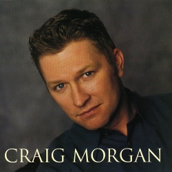
Post by Love Plastic Love on Jun 19, 2012 1:35:24 GMT -5
For some reason Craig Morgan's is killing me LOL.
|
|
.indulgecountry
Diamond Member
Best Country Poster 2011, 2017, & 2018
"You left a mark on my face // And brought a dozen red flags in a vase"
|
Post by .indulgecountry on Jun 19, 2012 2:22:12 GMT -5
I agree with all of those Jordan Stacey, save for Men & Mascara. I like the cover for that one. Its definitely simple, but the color palette just works so effectively on it and I find it beautifully executed in result.
|
|


.jpg)