bb
Platinum Member
Joined: November 2011
Posts: 1,576
|
Post by bb on Feb 1, 2015 14:04:47 GMT -5
Like I don't think good album covers are essential or will determine the success of an era but...that cover is like shooting yourself in the foot. I know Kelly doesn't really care about visual aesthetics, I know she thinks they're sort of trivial and unimportant but you have to play the game to stay in the game?
|
|
14887fan
Diamond Member
Joined: November 2013
Posts: 11,256 
|
Post by 14887fan on Feb 1, 2015 14:06:39 GMT -5
Dreadful.
|
|
SoMuchToSay
3x Platinum Member
Joined: August 2010
Posts: 3,497
|
Post by SoMuchToSay on Feb 1, 2015 14:10:09 GMT -5
I'm not a huge fan of the covers, but mainly b/c of how solid her covers have been in the past (w/ the exception of Thankful). I would hate it a little less if it weren't for the partial shaved head. It's like a LGBT version of the AIEW cover. Which I feel like should work, but it's definitely not for me.
|
|
|
|
Post by krisclarkson on Feb 1, 2015 14:11:36 GMT -5
Typical. Whenever it comes to anything visually appealing kelly always runs the other direction. I don't get it. As a hard core fan since idol it is the one thing about her that I don't understand. Oh well I'll make my own cover with the citizen shoot
|
|
bitchplease
Gold Member
Dupe
Joined: January 2015
Posts: 551
|
Post by bitchplease on Feb 1, 2015 14:27:43 GMT -5
lol at the meltdown
at least her face is on it and its not plain black n white boring cover like stronger's cover zzZzzz....
maybe the physical version will have hollogram cover? thatd be cool. but who are we kidding, its kelly! thats not gonna happen haha
i just put the deluxe cover for heartbeat song's cover art on my iTunes, and it looks good on my iphone. its colorful and different.
i probably will buy the deluxe CD only this time, since they both are basically the same picture, looking straight to camera or to the side hahah luv it.
im very happy that her face and her whack ass haircut made the cover!! yay bring it kelly!
|
|
Deleted
Joined: January 1970
Posts: 0
|
Post by Deleted on Feb 1, 2015 14:38:32 GMT -5
Well this was a short era.
|
|
ƒreakshow
9x Platinum Member
Flop Tart
🍷 💔 ☀️🥀
Joined: July 2007
Posts: 9,953
|
Post by ƒreakshow on Feb 1, 2015 14:42:06 GMT -5
I get the impression that they sent her an email of the cover for her thoughts/approval, to which Kelly glanced at and said "cool", then went back to playing with River.
|
|
Envoirment
Diamond Member
Joined: December 2009
Posts: 13,569
|
Post by Envoirment on Feb 1, 2015 14:42:11 GMT -5
LOL even I could do a better job. Either way, I'm excited to hear the album! I'll just change the album cover once I buy it.
|
|
Deleted
Joined: January 1970
Posts: 0
|
Post by Deleted on Feb 1, 2015 14:45:28 GMT -5
I get the impression that they sent her an email of the cover for her thoughts/approval, to which Kelly glanced at and said "cool", then went back to playing with River. I get the impression that email went straight to her junk mail. |
|
Deleted
Joined: January 1970
Posts: 0
|
Post by Deleted on Feb 1, 2015 14:54:17 GMT -5
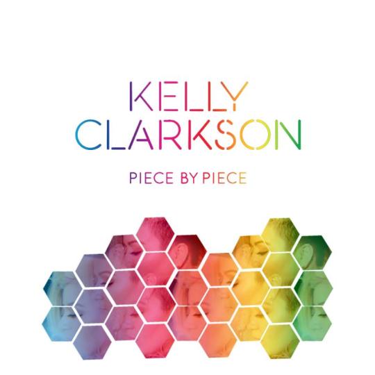
Jesus, my PMA 2014 images had more thought and effort put into them than this. Like I don't think good album covers are essential or will determine the success of an era but...that cover is like shooting yourself in the foot. I know Kelly doesn't really care about visual aesthetics, I know she thinks they're sort of trivial and unimportant but you have to play the game to stay in the game? There's a difference between "I don't care about visual aesthetics" and "I am going to go out of my way to be as aesthetically unpleasing as possible" though, so I just don't get this. The "not the official cover" cover is the epitome of giving a middle finger to the pressure of 'playing the game' - it literally is nothing but her name and album title in thin stencil font and some falling hexagons - but it was perfect. I will be the one person to say I don't actually hate the standard and deluxe covers (that by no means indicates that I like them, I just don't find them hideous like everyone else seems to). But I just think they're ridiculously dumb b/c they actually spent wasted money on that. I could think of I don't know, 10 different designs off the top of my head right now to go with a Piece By Piece inspired them, and every single one of them is simple yet effective and would have cost little to no money. Most of those ideas wouldn't have required a photoshoot...but if they just needed or wanted to have a photoshoot, they could have simply taken the standard or deluxe photo and used it just one time, put a hexagon overlay on top of it, or broken it up into hexagon/puzzle pieces and made that the cover. Either of those ideas would have been better than this oddly failed attempt at mirrored images. It's especially strange given that the artwork for everything else so far has been SO on point and cohesive - HS's single cover, the lyric snippet images on her website, the box set - they all relied on simple geometric shapes and eye-popping, yet pleasing colors, so I don't know why they would break from what seemed to be an established theme for this. It occurred to me after seeing the Citizen shots that what makes Kelly's anti-image stance so frustrating sometimes is that it isn't entirely consistent. When she was on Duets we were saying the same thing that some have about the Citizen shoot - "man, I wish she'd hire whoever is styling her there full time!" Wrapped In Red - flawless. Really, the whole time span between when she kicked off the Stronger era and the first year of WIR spoiled us b/c she was styled so well almost the whole time. She goes back and forth between being on 100 and then going back down to 50, and while I know that is all dependent on how she feels at any given time, it's admittedly hard to settle into the idea of her not caring when she keeps giving us glimpses of how amazing she looks when she does care, or at least lets someone else who cares on her behalf take over. And Kelly is a pretty woman (IMO) so it takes some real not-giving-a-f**k determination for her to look bad. I love her to death but this woman will forever be somewhat of a headscratcher, even for the most understanding fan. I'm just really glad I ordered the box set now. Hmm. Maybe this is a really elaborate plan to get people to buy the box set hahaha. |
|
|
|
Post by Love Plastic Love on Feb 1, 2015 15:00:03 GMT -5
That is seriously one of the worst cd covers I have seen in a long time. I have seen fans whip up better in 15-30 minutes on some torrented photoshop program for free. I will probably just pick my favorite fan cover and go with that.
|
|
Revelry
2x Platinum Member
Joined: June 2008
Posts: 2,160
|
Post by Revelry on Feb 1, 2015 15:13:02 GMT -5
Jesus, my PMA 2014 images had more thought and effort put into them than this. Like I don't think good album covers are essential or will determine the success of an era but...that cover is like shooting yourself in the foot. I know Kelly doesn't really care about visual aesthetics, I know she thinks they're sort of trivial and unimportant but you have to play the game to stay in the game? There's a difference between "I don't care about visual aesthetics" and "I am going to go out of my way to be as aesthetically unpleasing as possible" though, so I just don't get this. The "not the official cover" cover is the epitome of giving a middle finger to the pressure of 'playing the game' - it literally is nothing but her name and album title in thin stencil font and some falling hexagons - but it was perfect. I will be the one person to say I don't actually hate the standard and deluxe covers (that by no means indicates that I like them, I just don't find them hideous like everyone else seems to). But I just think they're ridiculously dumb b/c they actually spent wasted money on that. I could think of I don't know, 10 different designs off the top of my head right now to go with a Piece By Piece inspired them, and every single one of them is simple yet effective and would have cost little to no money. Most of those ideas wouldn't have required a photoshoot...but if they just needed or wanted to have a photoshoot, they could have simply taken the standard or deluxe photo and used it just one time, put a hexagon overlay on top of it, or broken it up into hexagon/puzzle pieces and made that the cover. Either of those ideas would have been better than this oddly failed attempt at mirrored images. It's especially strange given that the artwork for everything else so far has been SO on point and cohesive - HS's single cover, the lyric snippet images on her website, the box set - they all relied on simple geometric shapes and eye-popping, yet pleasing colors, so I don't know why they would break from what seemed to be an established theme for this. It occurred to me after seeing the Citizen shots that what makes Kelly's anti-image stance so frustrating sometimes is that it isn't entirely consistent. When she was on Duets we were saying the same thing that some have about the Citizen shoot - "man, I wish she'd hire whoever is styling her there full time!" Wrapped In Red - flawless. Really, the whole time span between when she kicked off the Stronger era and the first year of WIR spoiled us b/c she was styled so well almost the whole time. She goes back and forth between being on 100 and then going back down to 50, and while I know that is all dependent on how she feels at any given time, it's admittedly hard to settle into the idea of her not caring when she keeps giving us glimpses of how amazing she looks when she does care, or at least lets someone else who cares on her behalf take over. And Kelly is a pretty woman (IMO) so it takes some real not-giving-a-f**k determination for her to look bad. I love her to death but this woman will forever be somewhat of a headscratcher, even for the most understanding fan. I'm just really glad I ordered the box set now. Hmm. Maybe this is a really elaborate plan to get people to buy the box set hahaha. This. |
|
franklin
9x Platinum Member
Joined: April 2010
Posts: 9,635
|
Post by franklin on Feb 1, 2015 15:13:37 GMT -5
It's so bad I don't even have the desire to comment.
|
|
lunaboona
New Member
Joined: December 2010
Posts: 225
|
Post by lunaboona on Feb 1, 2015 15:15:29 GMT -5
I wouldn't be surprised if the album art work has a 3D/holographic effect to it which obviously would not capture well in a low quality picture.
|
|
bb
Platinum Member
Joined: November 2011
Posts: 1,576
|
Post by bb on Feb 1, 2015 15:18:42 GMT -5
Jesus, my PMA 2014 images had more thought and effort put into them than this. Like I don't think good album covers are essential or will determine the success of an era but...that cover is like shooting yourself in the foot. I know Kelly doesn't really care about visual aesthetics, I know she thinks they're sort of trivial and unimportant but you have to play the game to stay in the game? There's a difference between "I don't care about visual aesthetics" and "I am going to go out of my way to be as aesthetically unpleasing as possible" though, so I just don't get this. The "not the official cover" cover is the epitome of giving a middle finger to the pressure of 'playing the game' - it literally is nothing but her name and album title in thin stencil font and some falling hexagons - but it was perfect. I will be the one person to say I don't actually hate the standard and deluxe covers (that by no means indicates that I like them, I just don't find them hideous like everyone else seems to). But I just think they're ridiculously dumb b/c they actually spent wasted money on that. I could think of I don't know, 10 different designs off the top of my head right now to go with a Piece By Piece inspired them, and every single one of them is simple yet effective and would have cost little to no money. Most of those ideas wouldn't have required a photoshoot...but if they just needed or wanted to have a photoshoot, they could have simply taken the standard or deluxe photo and used it just one time, put a hexagon overlay on top of it, or broken it up into hexagon/puzzle pieces and made that the cover. Either of those ideas would have been better than this oddly failed attempt at mirrored images. It's especially strange given that the artwork for everything else so far has been SO on point and cohesive - HS's single cover, the lyric snippet images on her website, the box set - they all relied on simple geometric shapes and eye-popping, yet pleasing colors, so I don't know why they would break from what seemed to be an established theme for this. It occurred to me after seeing the Citizen shots that what makes Kelly's anti-image stance so frustrating sometimes is that it isn't entirely consistent. When she was on Duets we were saying the same thing that some have about the Citizen shoot - "man, I wish she'd hire whoever is styling her there full time!" Wrapped In Red - flawless. Really, the whole time span between when she kicked off the Stronger era and the first year of WIR spoiled us b/c she was styled so well almost the whole time. She goes back and forth between being on 100 and then going back down to 50, and while I know that is all dependent on how she feels at any given time, it's admittedly hard to settle into the idea of her not caring when she keeps giving us glimpses of how amazing she looks when she does care, or at least lets someone else who cares on her behalf take over. And Kelly is a pretty woman (IMO) so it takes some real not-giving-a-f**k determination for her to look bad. I love her to death but this woman will forever be somewhat of a headscratcher, even for the most understanding fan. I'm just really glad I ordered the box set now. Hmm. Maybe this is a really elaborate plan to get people to buy the box set hahaha. Okay no I think it's exactly not caring about visual aesthetics? Kelly has repeatedly stressed that her image and her appearance are among the least interesting concerns of her career and that she finds image culture as it pertains to her music completely irrelevant. There's silliness in suggesting that it's anything else, she is a pop-star who is decidedly and intentionally anti-diva, anti-image culture, and uninterested in the most superficial side of her commercial product. What other reason could there be other than an express lack of interest in crafting an appealing and marketable image, seriously. Edit: I don't get it either, really, but my guess is it took the least amount of money/effort possible and Kelly said why not. |
|
BDGeek
2x Platinum Member
Joined: October 2013
Posts: 2,603
|
Post by BDGeek on Feb 1, 2015 15:34:18 GMT -5
I wouldn't be surprised if the album art work has a 3D/holographic effect to it which obviously would not capture well in a low quality picture. Gilding crap with diamonds doesn't stop it from being crap. |
|
|
|
Post by krisclarkson on Feb 1, 2015 16:06:32 GMT -5
What is frustrating to me is that Kelly's determination not to "conform" to industry standards when it comes to her image and anything about her job visually(videos, photo shoots, etc) is that the more she doesn't care about her image the more her image gets talked about and to the general public overshadows her music at times. It's having the reverse affect.
|
|
Deleted
Joined: January 1970
Posts: 0
|
Post by Deleted on Feb 1, 2015 16:12:24 GMT -5
This has got to be a joke or a mistake. I'm seriously starting to worry about this era. Pop radio doesn't seem to be on board, song is not doing great on iTunes either. Album cover is terrible even by Kelly standards and whenever she decides to start promoting in the US all the attention will be on her weight, not the music. There's a storm coming.
|
|
dbhmr
Diamond Member
>
Joined: January 2005
Posts: 23,333
|
Post by dbhmr on Feb 1, 2015 16:45:34 GMT -5
What is frustrating to me is that Kelly's determination not to "conform" to industry standards when it comes to her image and anything about her job visually(videos, photo shoots, etc) is that the more she doesn't care about her image the more her image gets talked about and to the general public overshadows her music at times. It's having the reverse affect. This is an excellent point. She inadvertently makes things about image more than other more image-conscious stars. |
|
jessayli
Gold Member
If you speak, you'll only piss 'em off. If you don't, you're another robot.
Joined: June 2008
Posts: 638
|
Post by jessayli on Feb 1, 2015 16:50:29 GMT -5
I don't actually think the album cover is all that hideous. I prefer it over both the AIEW and Thankful covers.
|
|
kmbgs
7x Platinum Member
Joined: October 2008
Posts: 7,242
|
Post by kmbgs on Feb 1, 2015 16:50:27 GMT -5
I'm bracing myself for this era. Especially after how well Stronger, GH, and WIR all went. I just hope I like the music, because if that cover indicates anything we are in for a BUMPY ride folks.
|
|
|
|
Post by musiclover98 on Feb 1, 2015 16:59:26 GMT -5
So umm....no...just no. What is actually happening? The cover looks like it was made on an iPhone 4.
|
|
Deleted
Joined: January 1970
Posts: 0
|
Post by Deleted on Feb 1, 2015 17:04:28 GMT -5
Because the artwork leaked through Target, her team can deny that that was ever the finalized artwork and, hopefully, put together something more appealing and consistent with what they have already done for the era. The negative comments made both here and across social media should make them aware that they need to do something. Knowing that her team rarely reacts like that, though, that cover's likely the cover forever. That said, I disagree that the era's doomed because the cover sucks, but artwork does draw shoppers over when browsing and I wish they went with something more appealing.
|
|
Krim
New Member
you made me feel unbroken
Joined: February 2008
Posts: 232
|
Post by Krim on Feb 1, 2015 17:12:14 GMT -5
I never thought Blackout would have competition, holy shit.
|
|
|
|
Post by Love Plastic Love on Feb 1, 2015 17:18:47 GMT -5
What kills me is that I actually think its a decent picture of her so they could have just...had the picture and some simple color scheme and design with it. It would have taken less work and, even if boring, wouldn't have been as hideously ugly and amateur looking. Like, they did more work to make it look worse.
Ok, that is my last post about the cover, promise. I won't condemn the entire era because of the cover though.
|
|
ƒreakshow
9x Platinum Member
Flop Tart
🍷 💔 ☀️🥀
Joined: July 2007
Posts: 9,953
|
Post by ƒreakshow on Feb 1, 2015 17:35:51 GMT -5
This has got to be a joke or a mistake. I'm seriously starting to worry about this era. Pop radio doesn't seem to be on board, song is not doing great on iTunes either. Album cover is terrible even by Kelly standards and whenever she decides to start promoting in the US all the attention will be on her weight, not the music. There's a storm coming. I kind of had a feeling we'd be plagued by these things with this album, it's one of the reasons I set my expectations low for all aspects because Kelly/her image, the public, and the music itself can be very unpredictable. With Kelly, certain things have to align in a particular way for her to be successful. Given this new laid back "approach" of hers and this sloppy appearance she's keeping, nothing is going to align properly, so I'm not going to waste my time getting worked up over any of this. Her priorities have simply moved elsewhere. It might be difficult to swallow to see her career be handled the way Britney Spears' latest music has been, but it looks like that's what we're going to get. I know it's lame to say, but I'm taking the defeated fan attitude by saying I'm just looking forward to the music at this point. It likely won't be anything new or different or tapping into Kelly's true potential the way we know she's capable of, but the music will be an enjoyable listen at the least. I was/am very much pleased by Heartbeat Song and still maintain my belief that it's her best single since the AIEW album, I don't understand the hate it's receiving. Sure it might be immature and beneath her and isn't a new direction, but the subject matter is something you can tell she's feeling and fits her life perfectly. With that being said, I hope something from the album can go on to be a moderate success like MKIA or CMB. |
|
xline06
Gold Member
Joined: September 2009
Posts: 505
|
Post by xline06 on Feb 1, 2015 18:01:54 GMT -5
What the hell of this freaking situation to her and her team?!
I loved all of her previous covers from albums and singles. I cannot believe this perfectly frustrating front cover for her 6th studio album.
OMG. Puzzle? Pieces? Who's the chief designer to decide this final image cut?
Is there any special identity presenting pieces of her faces????????
No way.
|
|
slayZ
3x Platinum Member
Joined: November 2010
Posts: 3,232
|
Post by slayZ on Feb 1, 2015 18:15:30 GMT -5
What is frustrating to me is that Kelly's determination not to "conform" to industry standards when it comes to her image and anything about her job visually(videos, photo shoots, etc) is that the more she doesn't care about her image the more her image gets talked about and to the general public overshadows her music at times. It's having the reverse affect. Ding ding ding. It's never going to be "just about the music" with her when she's not putting any kind of effort whatsoever into any other aspect of her career. This era is giving me My December teas already and what's sad is that it'll probably not even achieve the level of success MD did. |
|
StrongBreakaway
Platinum Member
You love me
Joined: January 2013
Posts: 1,210
|
Post by StrongBreakaway on Feb 1, 2015 18:18:17 GMT -5
 Can we start a petition? |
|
Jack
8x Platinum Member
King of the World
Joined: October 2008
Posts: 8,514
|
Post by Jack on Feb 1, 2015 18:23:13 GMT -5
^ That's great.
|
|